
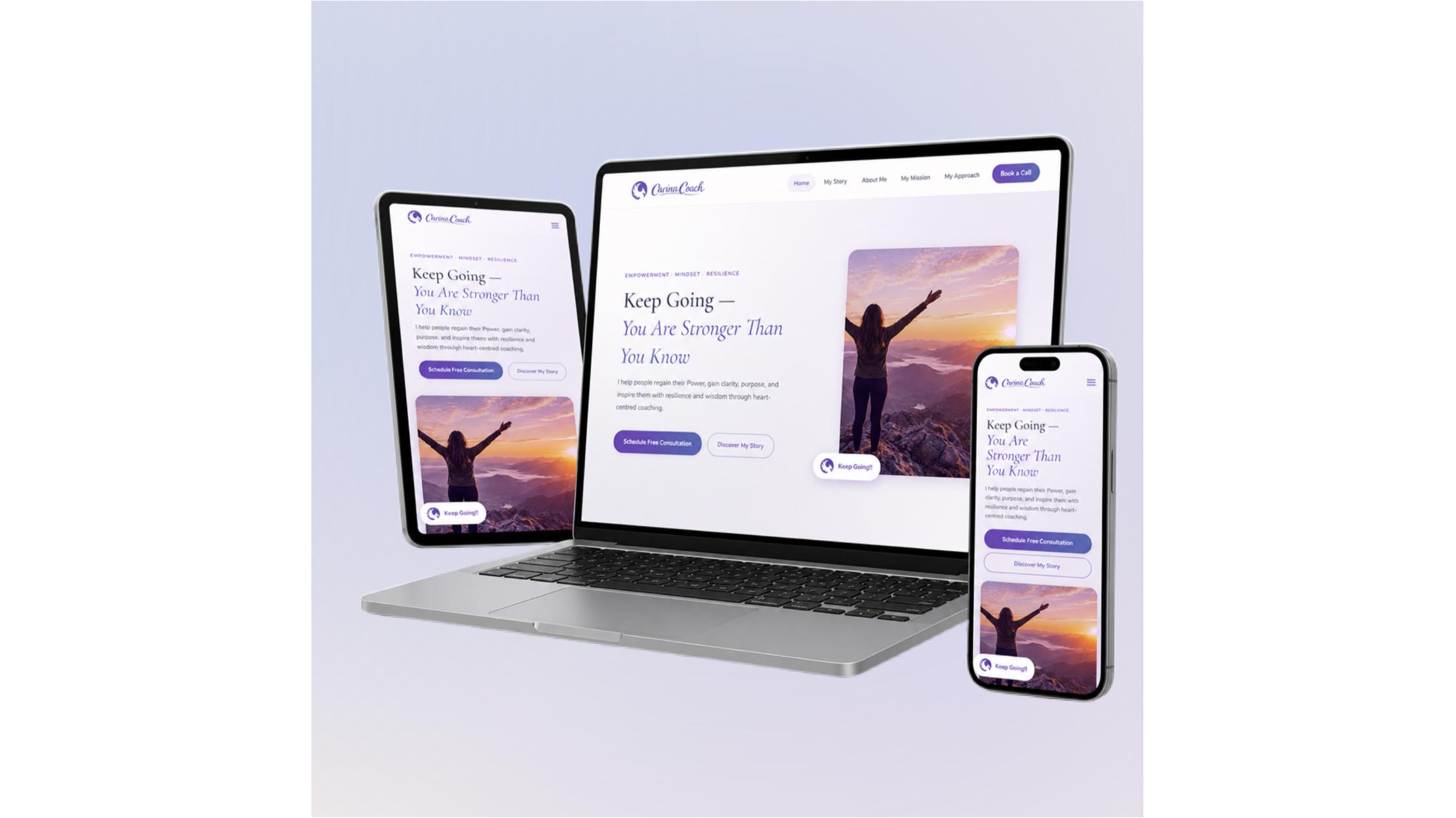
Open 10 service business websites and count how many make you scroll, squint, and guess before you understand what the company actually does.
Most visitors won’t give you that time. They land on a homepage, glance around for a few seconds, and decide whether to stay or leave. If the answer to “what do they do and why should I care?” isn’t obvious almost immediately, they’re gone.
A lot of service businesses lose customers before a single email or phone call, simply because their website made people work too hard to understand the offer.
5 Things Service Businesses Get Wrong With Website Design
1. The offer is buried
Visitors should quickly understand what the business does, who it helps, and why the service matters. Vague opening messages make that harder.
2. Every message competes for attention
Adding more information does not automatically make a site more useful. When everything appears equally important, visitors have trouble knowing where to focus.
3. Trust appears at the wrong moment
Proof, process, testimonials, and expectations can help someone move forward, but they are more useful when they appear alongside the questions they answer.
4. Calls to action feel forced
A button asking visitors to get in touch works better when it follows enough context to make the action feel relevant.
5. Design starts before the decision is clear
Jumping into layouts and visual direction before clarifying the audience, offer, objections, and desired action can produce a polished website without a clear path to conversion.
Why Clarity Matters More Than Decoration
A good-looking website makes an impression, but visual polish cannot explain an unclear offer. Strong design should make information easier to understand and guide attention toward the parts of the page that matter.
Clarity should come before decoration. A thoughtful website connects strategy, hierarchy, messaging, interface design, and development around the decision a qualified prospect needs to make.
That does not mean every service website should look the same. Different businesses can use different visual approaches while still giving visitors a clear path from recognizing a need to understanding the offer, building confidence, and taking the next step.
5 Website Design Choices That Actually Convert
1. Make the offer immediately understandable
Give visitors a clear answer to what you do, who it is for, and why they should care.
2. Organize pages around questions
Each section should naturally answer the next question a prospective customer is likely to have.
3. Put trust where it helps decisions
Use proof, process details, and expectations when visitors need reassurance rather than treating them as filler.
4. Create a natural next step
The call to action should follow the visitor’s journey and make sense in the context of the information they have just read.
5. Connect strategy, design, and development
A conversion journey works best when messaging, responsive design, contact flows, and front-end development are planned as parts of the same experience.
Your Website Is the Introduction Before the Conversation
For many service businesses, the website is the first introduction a potential client has to the company. Before anyone sends an inquiry or schedules a call, the site has already started communicating what the business does and what it might be like to work with.
The strongest websites make that introduction easy to understand. They give the right visitor a clear offer, relevant proof, useful answers, and a reason to take the next step.
A service website does not have to overwhelm visitors with content or visual effects; it needs a clear path from interest to action. When every element has a purpose, the website can make a good introduction before the business owner ever enters the room.
Hercules Designs
3450 Third Avenue Unit 411
San Diego
CA
92103
United States


